Tuesday, December 14, 2010

Final Group Project


GROUP RATIONALE

For our visual, we created an affinity map. Often, an affinity map is used when brainstorming. Items are placed on four axes. For our project, we created an affinity map that organized the assignments we have had in Introduction to Visual Communications. We included the “How-To: Spaghetti Dinner,” Geographical Map, Collage, Mind Map, Concept Map, Flow Chart, Multivariate, Simple Graphs and Charts, and the Lawn Care assignment. It is our experience that these sketches allowed students to implement visual concepts learned in class.

On one axis, there was Imaginative on one side and Confining on the other. On the other axis, the labels were Hard to Easy. Our group chose where each assignment would go. It is important that we explain our definitions for the labels we chose. We understand Imaginative for this set-up as meaning “allowing creativity.” Assignments toward this end tended to be more original. They often included an artistic element. Confining for this project is understood as “having rigid rules and structure.” The assignments placed closer to this label tended to give students less ability to go off on their own ideas. The label “Hard” refers to the amount of work and the level of ability required by the student to complete the task. We considered the length of time needed to complete the assignment and the complicity of the sketch’s rules when placing our items on Hard and Easy axis.

After much deliberation and discussion, our group was able to decide where to place our sketch items. It is acknowledged that a different group of students may have placed their sketches on different places throughout the affinity map. This is what makes this project especially unique. The actual sketches were our group members’ best sketches picked by the four of us.
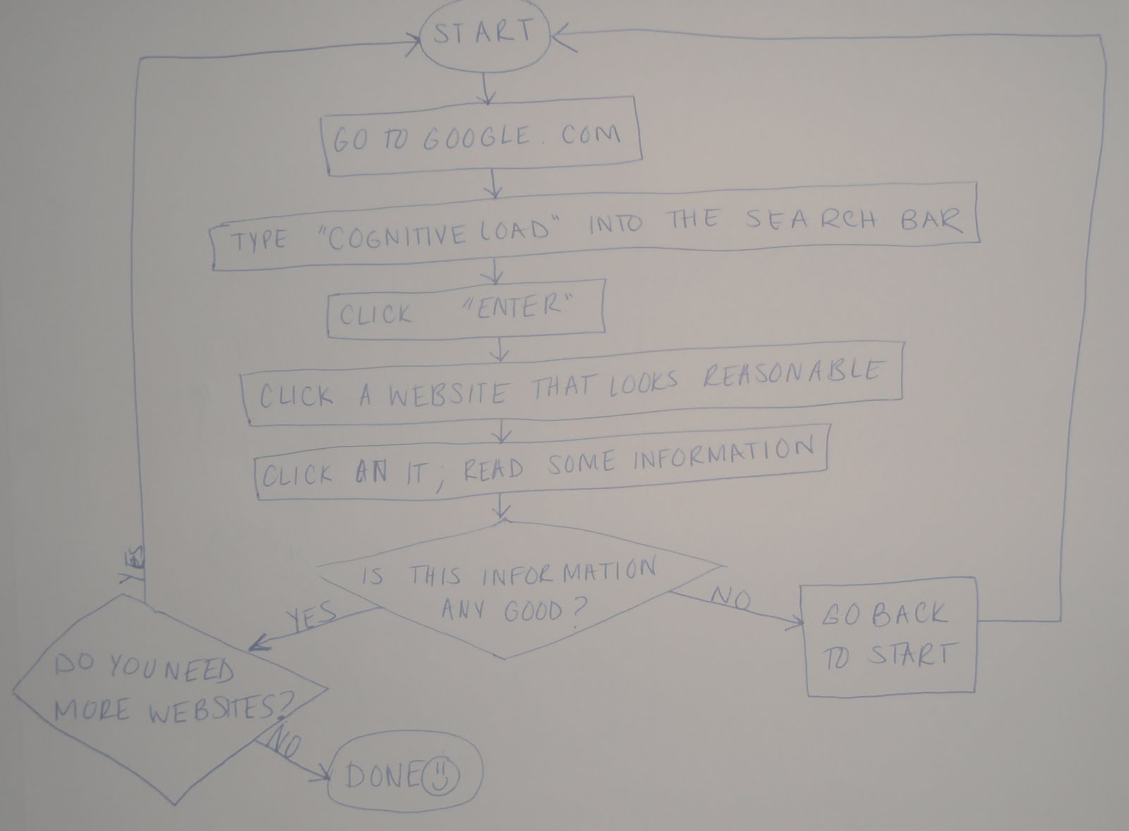
After taking this class, it is impossible to ignore visual decisions when creating a poster. On our poster, we used different colors to represent each of the four quadrants. This tends to lessen the cognitive load because viewers can observe the items in one quadrant as being “together” or “similar.” As they start to see these items of the same color as part of a group, the Gestalt principle of proximity occurs. This means that when items are closer together, they are considered part of a whole. Also, our group wanted to fill in space on the poster by adding principles we have learned in class. However, we decided against this. Executing Occam’s Razor, defined as “The principle that one should not increase, beyond what is necessary, the number of entities required to explain anything,” we decided that the visual impact of just the sketches on the graph produced the desired result.

Before creating our visual we had also agreed upon a targeted audience. Given the nature of our visualization we decided that the perfect target audience would be a college freshman student indecisive about enrolling in this class. As typical college students we acknowledged that important factors that play a role in our picking of classes are its content, difficulty (although it shouldn’t), workload, and experience. Our visualization thus provides the uncertain student a preview of the material, examples of the types and number of assignments, and most importantly how difficult or easy those assignments are.

PERSONAL REVIEW

In creating this assignment, it was difficult for our group to come up with a clear way to demonstrate what we learned in class. To come to the design we chose, an affinity map, we first created a mind map. Off of this mind map were the sketches, the class assignments, concepts, and principles. Our original idea was to do a flow chart that went off into different sketches we had learned. However this idea proved to be disorganized. We could not come up with a visual that would be clear for viewers to understand. An affinity map was the chosen solution for our group for two valuable reasons. First, no one in the group had completed an affinity map so this process benefited to our personal learning experiences. Secondly, with an affinity map we could clearly display our sketches while giving meaning to them in terms of our evaluation of them. As explained in our design rationale, we evaluated the sketches on terms of Hard and Easy, as well as, Imaginative and Confining. I had a great experience with my group during this process. Collaborating with others on ideas made our final outcome the best it could be in my opinion. Determined to satisfy our target audience’s comprehension of our semester’s assignment the affinity map displayed our sketches in a logical fashion.

Monday, December 6, 2010

#10 Multivariate Display

SUBJECT:
Income and Mortality Rates


BACKGROUND:
In my Multicultural Psychology class, we are learning about the differences in mortality rates among races. For example, African Americans have a higher mortality rate in 13 out of 15 top causes of death in comparison to European Americans. Some of these death causes are car accidents, heart disease, etc. She explained to us differences between European American mortality rates and other races, such as Asian Americans. Asian Americans are more likely to live 5-7 years longer than European Americans. Our professor asked to consider how income is a factor in these statistics. She showed us that a higher income consistently produced lower mortality rates. Even when the gap was extremely low between incomes, even by $10,000, the mortality rate was still lower for the higher income. For example, an income of $80,000 would have a lower mortality rate than an income of $70,000.


QUANTATIVE DATA:
The three variable in my data are income, status, and mortality rate.
WHAT DOES THIS TELL US? A STORY:
It was difficult to find information on this topic. However, I found information that shows that the morality rate is low for higher incomes. This tells us that being poor gives you a higher chance of dying. This could be explained by many factors. It is possible that those who have a higher income have better doctors and receive more frequent care than those with low incomes. It is possible that those with lower incomes have jobs that are physical. Physical labor can cause health problems. It is also possible that those with lower incomes smoke cigarettes or drink alcohol more than those with higher incomes. These are all hypotheses based on the quantitative data given; they are by no means fact. Also, the graph contradicts the information my professor gave because the lower middle class has a lower mortality rate but these incomes are still at the lower end of the range.

GRAPH:

Wednesday, December 1, 2010

#9 Storyboard

#2.


In assignment two, I used two of the originals and created a storyboard. This was especially challenging because I had to incorporate two pictures which limited my narrative possiblities. In this storyboard, a disaster strikes and people have to be rescued. The first picture is not represenative of the entire area the disaster strikes, it is used to show a normal day is happening. (Boys are playing soccer.) The next picture shows the aftermath of an explosion at a firework factory. The next picture gives a visual of survivors trying to escape the polluted air post-explosion. The last picture shows the aftermath of a rescue situation where survivors are put in a secure and safe area. In this assignment, I used scene-to-scene to depict the different scenes that went on in the story.


#1.


In this assignment, I created a storyboard. I learned how elements of a story are separated in order to create one full story. In the first assignment, I took one of the original pictures and added three more to create a sequence of a narrative. In this visual, I used pictures to represent scene-to-scene actions. In the first scene, a girl is wandering around a park. In the second, she meets a group of strange children. The third scene has FBI agents flooding the park. The forth scene is the children being found out; they are robots.

While creating this, I had trouble keeping with a story. It was hard to represent my story in only four pictures. I had difficulty explaining the story in such a short content. I thought the assignment was interesting because it showed the work of the imagination; it was possible to go anywhere with the plot of the story given one picture. I found that from picture to picture the story could go in many directions. The outcomes were endless.

Thursday, November 18, 2010

#8 Simple Tables to Graphs

(Please click to enlarge picture)
I am unfamiliar with Excel so my charts were pretty simple. It took me a long time to create the pie graphs and bar graphs. First, I started with a simple chart which just displayed the information. My topic was male and females who applied to RWU and those who were accepted. Then, I separated the information into two graphs in order to simplify the information. I showed who had been accepted in one graph and who had applied in another graph. In the last graph, I put all of this information together.
The great thing about charts is the observations you can gather from looking at them. From looking at this last chart, you can see that obviously more people apply than get in. It is also visible that a significant amount of people are not accepted. More females apply than males and more females are accepted. This shows that their are more females at RWU than males. From the first to pie charts, it is visible that more females are accepted and more females apply. Charts simplify information and make the cognitive load less for viewers. This is why they are helpful in displaying information.

Tuesday, November 9, 2010

#7 Flow Charts


The flow charts show two things. 1. How to buy a book on Amazon.com and 2. How to do a Google.com search on "Cognitive Load." These are fairly simple tasks to regular computer and Internet users. However, if you are not familiar with the Internet these may be difficult tasks for you. This flow chart simplifies the process. I found that it was extremely beneficial to list the steps in writing as I did them on my own as the first step in creating the flow charts. This helped to configure my flow charts. I find it interesting that shapes dictate instructions to the user. I think this is helpful in giving the viewer even more clues as to what they should be doing. It helps to reiterate the idea that they should be answering a question (diamond shape) or that they should be doing a process (rectangle shape).

In reflecting on this assignment, I feel that I will use this again. I have seen this type of chart commonly in magazines when I was in middle school. They would use flow charts in quizzes, such as "What Kind of Friend Are You?" With the use of Yes or No questions you would come to your outcome, telling you, in this example, what kind of friend you are: too easy-going, too needy, perfect friend. It would also give advice on what to do with your outcome. It was cool for me to see how to do this type of chart and remember this from my past.

#6 Explanation Graphic

The graphic I chose to improve was on I found on the internet. It attempted to show how to get rid of fruit flies by creating a trap. The trap consisted of a jar filled with wine and fruit pieces with a paper cone on top to keep the flies trapped in. While this is a great solution to ridding your house of fruit flies, the graphic was extremely confusing. It had real life pictures of someone creating the trap which was beneficial, however, the pictures and instructions were all over the page. There was no alignment. The instructions could be above or below the picture. The pictures even overlapped. The font was also very small. I did my best to improve these elements in my graphics.


The first improvement I made was creating a list of "ingredients" to create the trap. I also included all of the "ingredients" in each step that were required. For instance, if scissors were needed for a step, they were shown in the step. I also improved the original by putting the picture, then the text. This is my first draft.


In my final draft, I found that alignment was extremely important in improving the picture. I used the same size text for all steps. I put the text all in line and the pictures all in line. I believe this creates a much clearer picture for viewers. This graphic will make their task easier to accomplish. I learned the importance of displaying your information in a way that makes viewing easier.

Monday, November 1, 2010

#5 How-To Make Spaghetti

In this sketch, I used what I learned in class to create the How-To. This is a step-by-step on how to make spaghetti. I had trouble with figuring out how to draw some of things but I thought the simpler the drawings, the easier it would be to understand. I did not know if I should write the word "Spaghetti" on the box but in class in the How-To Make a PB&J assignment, one group wrote "Jelly" on their jar to further emphasis what the drawing was. I used this idea in my sketch for further emphasis as well.

I found ending the drawing hard and also the transitions. I hope that the viewer will know the way the steps go. I used a line to distinguish between the steps. I also hope they know to look left to write. The end of the drawing was difficult. I drew the final product you should have if you complete the steps correctly-- this is a bowl of cooked spaghetti. I also drew a smiley face to symbolize the end. In class, we talked about an icon that shows the viewer that they are done. This could be a thumbs up or a drawing of the final product, or even as I showed-- a smiley :).